By Tech Powered Dad | March 18, 2013
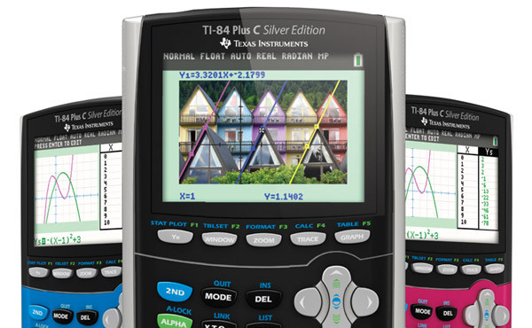
Click here to buy the TI-84 Plus C on Amazon!
UPDATE: (2/10/16) Since I wrote this review a couple of years ago, Texas Instruments has discontinued the TI-84 Plus C. While it continues to be available at some retail outlets like Amazon, I suggest taking a look at the newer model, the TI-84 Plus CE. You can follow this link to my TI-84 Plus CE Review.
With so much of the attention from Texas Instruments on the TI-Nspire line over the last 5 years or so, it was exciting news to learn that the TI-84+ family of calculators was getting a much needed face lift with addition of color. The new TI-84 Plus C is latest in a long line of graphing calculators that have dominated the market for over 20 years, a line that includes the TI-81, TI-82, TI-83, TI-83+, and TI-84+. Despite a number of enhancements along the way, they’ve all featured a very similar user interface. With the announcement from Texas Instruments that the TI-84 Plus C will not receive TI-Navigator WIFI support, unlike other recent TI models, it seems likely that the TI-84 Plus C will be the last new model in this iconic family.
But how does the new TI-84 Plus C stack up against other popular TI models, including the black and white TI-84 Plus Silver Edition (review) and TI-Nspire CX (review)? Frankly, I was expecting nothing more than the addition of color to the new model, but what I found was that there have been some important changes that give it a fresher, modern feel that is sorely lacking in the previous TI-84+ models.
What’s the same about the TI-84+ C Silver Edition?
A lot. Just as when making the move from the TI-83 to the TI-83+ or the TI-83+ to the TI-84+, many of the changes to the user interface will not be immediately obvious to current users of the TI-84 Plus, assuming you’ve kept your operating system up to date. If you are a long time user of the TI-84 Plus, you will be able to make the change to the TI-84 Plus C without missing a beat. The menu system and options are very, very similar to older models. The button layout is identical. If you are a student and your teacher teaches with the TI-84 Plus , you could bring a TI-84 Plus C to class and follow along without ever having to worry about whether you’ll be able to perform the same calculator functions your teacher is using.
What’s new about the TI-84 Plus C Silver Edition?
As similar as it is to older models, the TI-84 Plus C does feature some important new upgrades. Obviously, the first change you’ll notice as soon as you pick up the device and turn it on is the full color screen. You’ll also immediately notice that it is as light as a feather. In fact, you may wonder if it’s missing something inside. It is. The TI-84 Plus C doesn’t rely on the AAA batteries that its predecessors needed, instead using an internal battery that is rechargeable via mini-USB, just like most modern phones. I haven’t measured my exact usage time, but I’ve played with mine for at least a few minutes every day for the last few weeks, and I’ve hardly put a dent in the first charge. My guess is that even with heavy usage the average student could go at least a week on a single charge.
The display is what allows the new TI-84 Plus C to run circles around the older black and white models. While the obvious difference is the that the display is in color and backlit, I actually found the much higher pixel resolution to be just as important if not more important than the addition of color. With the older TI-84 models, the screen pixels are so big that you feel like you’re working with an early 1990’s dot matrix printer. Of course, this means everything the TI-84+C displays has a sharper look to it (a lot sharper), but the 84+C’s higher resolution offers several additional advantages.
First, menus are much nicer to work with. The higher resolution allows for more menu options on the screen at the same time, meaning you don’t have to scroll down so many times to see your options.
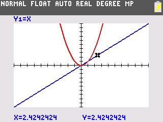
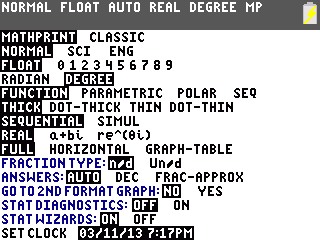
Second, the screen layout is slightly different with the TI-84 Plus C. You’ll now find all of the modes displayed across the top of the screen, a feature I wouldn’t mind seeing on the TI-Nspire. That means you won’t accidentally find out at the end of a trigonometry problem that you’ve solved it in degrees mode instead of radians. It’s displayed right at the top, and also includes your decimal settings and fraction settings, among others. The new screen layout is even more obvious in graphing mode. The TI-84+C shrinks the graph area down a bit compared to the older TI-84+, leaving an border around the graph where information such as trace coordinates and equations are displayed. If found it to be much easier to read and a big improvement.
Speaking of graphing, just like the TI-Nspire CX, the TI-84 Plus C now offers the ability to graph on color photographs. While the TI-84 Plus C can’t directly read image files like .jpg or .png, the free TI-Connect software can convert common image files into a format known as .8ca which the TI-84 Plus C does recognize. I gave the process a try myself, and it was a really simple drag and drop interface with TI-Connect. It worked perfectly for the .jpg I tried. There was some distortion when I tried a .png with the parts of the image that were supposed to be transparent. You can store up to 10 images at a time on the device and graph on any of them. Once you’ve got the image on the screen, you can select points on the screen and perform a regression on them to find an equation that fits your picture.

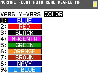
There are a few other minor differences with the TI-84 Plus C vs. TI-84 Plus. The TI-84 Plus C “VARS” menu now offers an additional “COLOR” submenu, helpful when using the “DRAW” features. The equation solver has also been tweaked to make it a little easier to use, but I’m not sure the average user will find it has changed the learning curve that much.
In the end, color is still the big draw here, and it’s the direction that both Texas Instruments and Casio seem to be going right now with their handhelds. We’ve had the Casio Prizm, the TI-Nspire CX, now the TI-84 Plus C, and soon the Casio ClassPad 400. While color is not a necessity in a graphing calculator, it is really beneficial to students, particularly in graphing mode, where it helps them distinguish between the functions they are graphing. As much as anything, the higher resolution display that seems to come with all of these color calculators like the TI-84 Plus C may be the biggest benefit. It really did allow TI to organize more information on the 84 Plus C screen in a manner that is easier to read and understand way.
Bottom Line TI-84 Plus C Review
The TI-84 Plus C is a substantial upgrade to the TI-84 Plus family of calculators. It’s hard to imagine that the TI-82 I remember as a teenager has evolved into a device with “mathprint” input, a full color screen, and the ability to graph on photographs. There are going to be two groups of people that look at the TI-84 Plus C and evaluate whether it’s right for them.
The first group is those who have stayed loyal to the TI-84 Plus family, either because school budgets haven’t allowed a change to the Nspire family or because they just love the way the family has evolved over the last couple of decades and they can’t imagine using anything else. If you are a loyal TI-82, 83, or 84 user, you owe it to yourself to upgrade to the TI-84 Plus C. Its display is a heck of a lot easier on the eyes, it’s much lighter, and it now has graphing capabilities the black and white 84+ will never have.
The second group is those who are trying to decide between buying a TI-84 Plus C or a TI-Nspire CX. Maybe you are buying a graphing calculator for the first time, or maybe you’ve been trying to decide about the jump to the Nspire platform. For students and educators, I still have to give the nod TI-Nspire CX, and it’s not really that close. It’s graphing, dynamic geometry, menu system are among the many features where the Nspire CX is still vastly superior to the 84 Plus C. At some point, I’ll probably do a side by side comparison of the two color handhelds from TI, but in the meantime, you may want to check out my review of the TI-Nspire CX vs. TI-84+. Even with the upgrade to the TI-84 Plus C, much of that comparison is still relevant.
The TI-84 Plus C kind of feels like a victory lap for the TI-84 family, and it’s an admirable one. As the platform that has dominated math classrooms across America for so long, it deserves it.
Please click here to buy the TI-84 Plus C on Amazon.
Please note that some links on this site are affiliate links, meaning a percentage of your purchase will support my work at Tech Powered Math at no additional cost to you. Thanks for your support!

